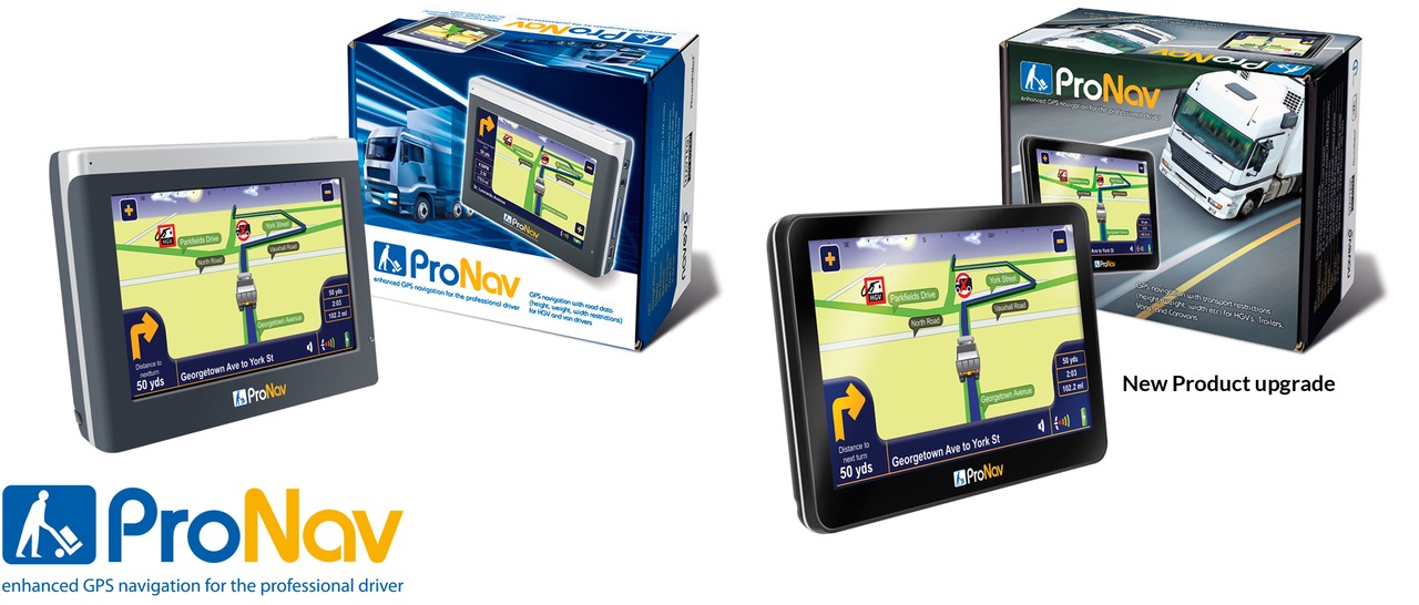
The ProNav logo was developed from an idea by the client. The original packaging design (left) retains a similar layout and colour scheme to bbnav. I was asked to create a suite of icons specifically for ProNav’s UI. The product developed quickly, with new hardware and more power. I was then given the opportunity to design new packaging. There were problems with obtaining good images of the updated hardware, so I created a master product image in Photoshop.